Automating Existing Conditions Analysis: One City a Time
This post shows an examples of an automated workflow from data processing, analysis and visualization that focuses on inspecting the current status of the City of Oakland, California, USA. The author developed a python script within Jupyter Notebook that gathers the data from publicly accessible API data points and generates interactive visualizations including tables, charts, and maps with Plotly and Folium. This brief report firstly demonstrates the potential benefits this workflow brings about at scale and some of the key insights the analysis unveils regarding urban planning and policy making. Then, it introduces the major components of the developed Python Script.
The Quick Snapshot of a City
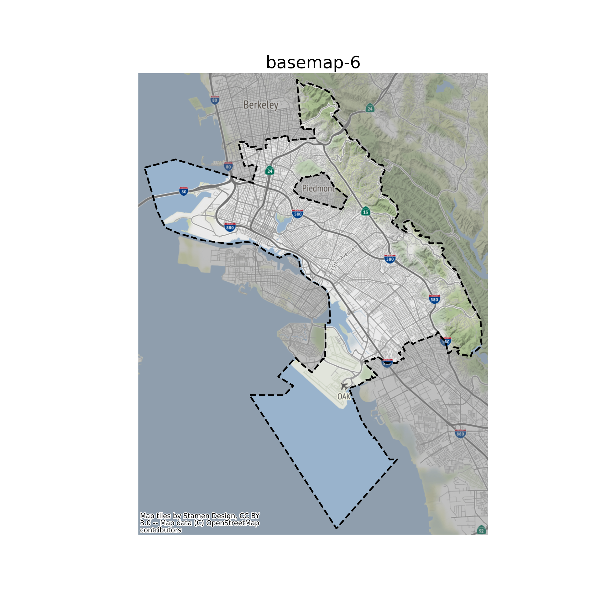
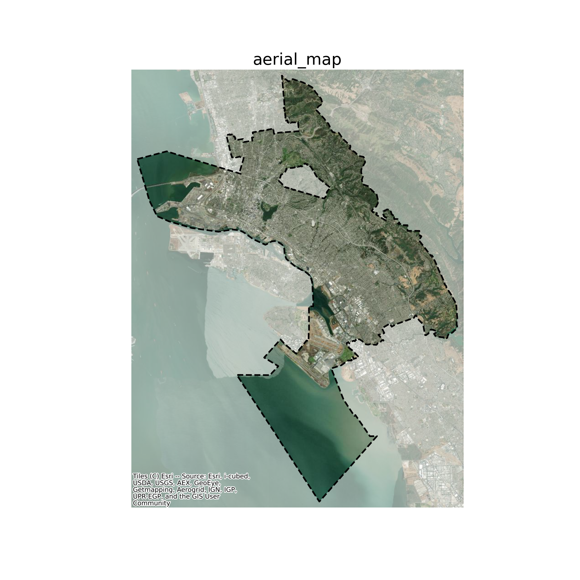
Where is the City of Oakland?
Oakland sits to the east of san Francisco across the bay. Below are two maps showing the City’s location and street network, as well as its land cover from aerial photograph:
Who live in the City?
The City of Oakland has a total population of 437,548 based on ACS 2017-2021 5 years estimate.
The median age of Oaklanders is 36.9, slightly younger than that of the California median age, and younger than the Alameda County overall.
Oakland has a diverse population. Among the population, 33.4% are White alone, much lower than the share in the state overall. 22% Oaklanders are Black or African Americans, and 15.7% are of Asian races, followed by other races and two or more races.
Currently 27.2% of Oaklanders have Hispanic or Latino origin, higher than that of the Alameda County, but lower than that of the State’s overall share.
The average household size of Oakland is 2.6 people, which is smaller than the State average.
It is coexisted with a higher percentage of population with higher education. 26.9% of Oaklanders have obtained a Bachelor’s Degree, and 13.9% have a Master’s Degree, compared to 21.9% and 9.1% of the State levels.
What Uses are in the City?
The City encompasses various land uses, from residential to commercial and industrial. Below is a chart showing the breakdown land uses from the most general category to the more granular uses. Hover over the chart to see detailed acreages by land use type.
A different way to look at this is the bar chart below. Except waterbody, which is due to the fact that the City Limits extend over the SF bay, residential uses is the main land use in the City, followed by open space, civic/institutional and then transportation.
Existing Land Use Map
Below is an overall map showing the various uses’ distribution. Indeed most of the City area is covered by residential uses.
.png | width=600)
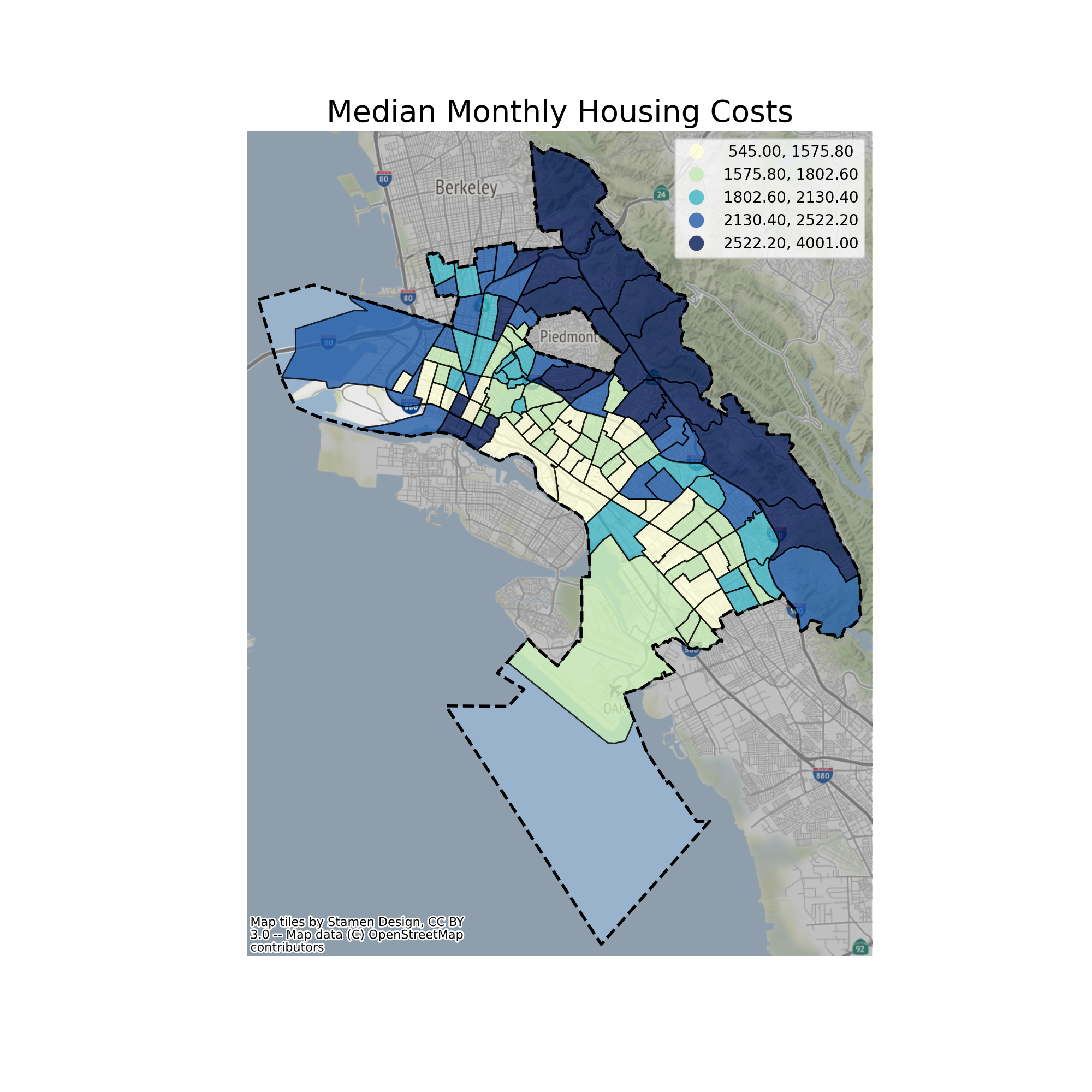
How much does it cost to live here?
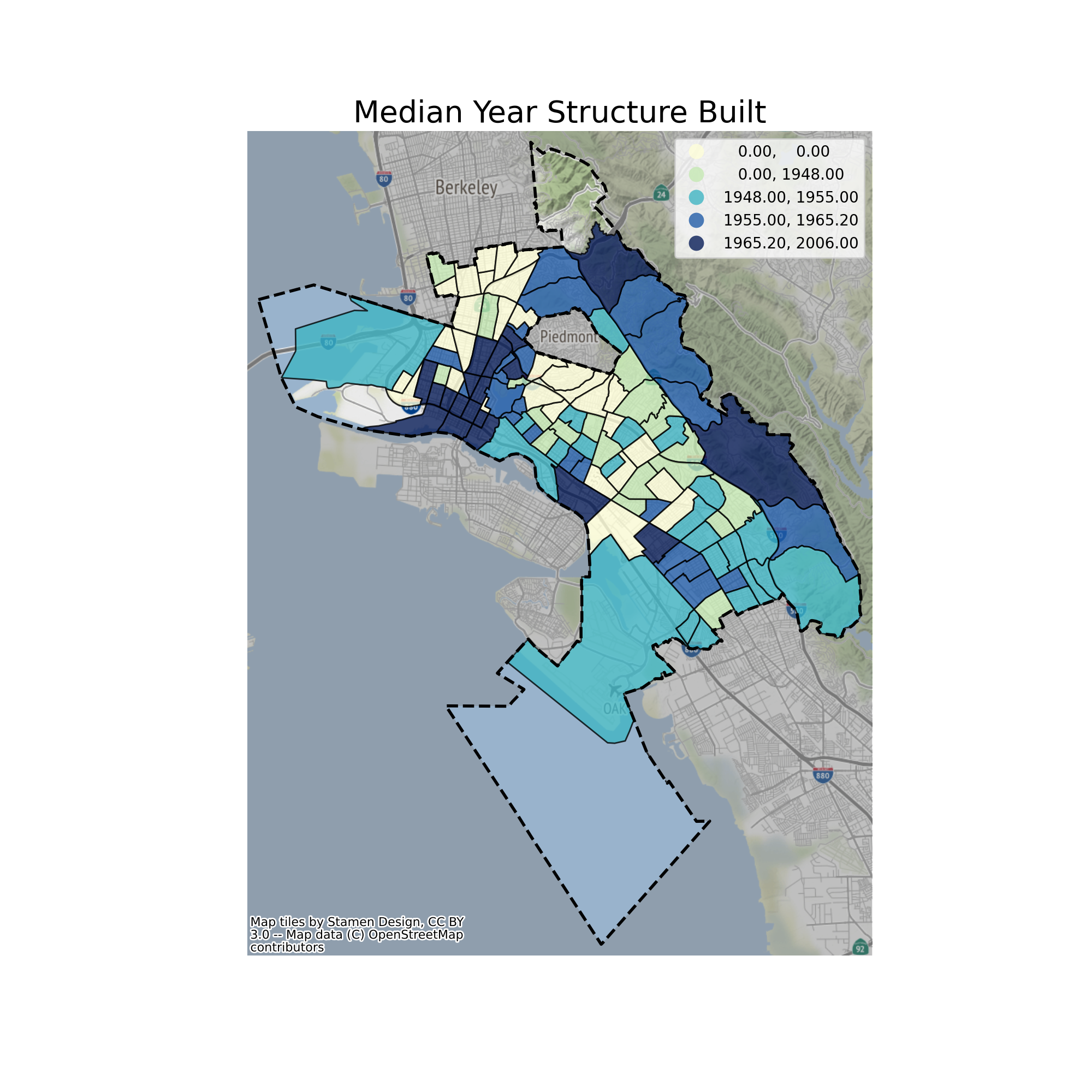
As a City that dates its history back to the mid-19th century, Oakland’s housing stock is generally older than that of the Alameda County and State of California overall.
As a middle-sized city, Oakland has a lot to offer in terms of housing. However, Oaklanders also face considerably rising housing costs, something that has been commonly experienced throughout California.
Median Monthly Housing Costs
Median Household Income
.png)
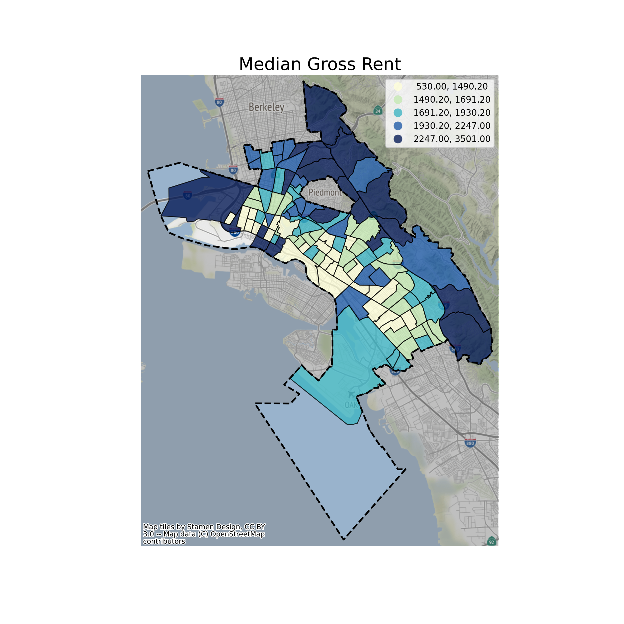
Where is the most/least affordable neighborhood?
The City’s housing cost can range largely from average to very expensive levels, depending on locations. Below is a map of the median gross rent per month across different neighborhoods in the City. Places with better transportation access, such as Downtown Oakland and the border area with Emeryville, generally show up with higher rent, while central and east Oakland along the industrial corridor generally are more affordable to rent.
 Comparing the above map with the below map of median home value, it is also observable that the traditionally wealthy neighborhoods on the hills have much higher property values.
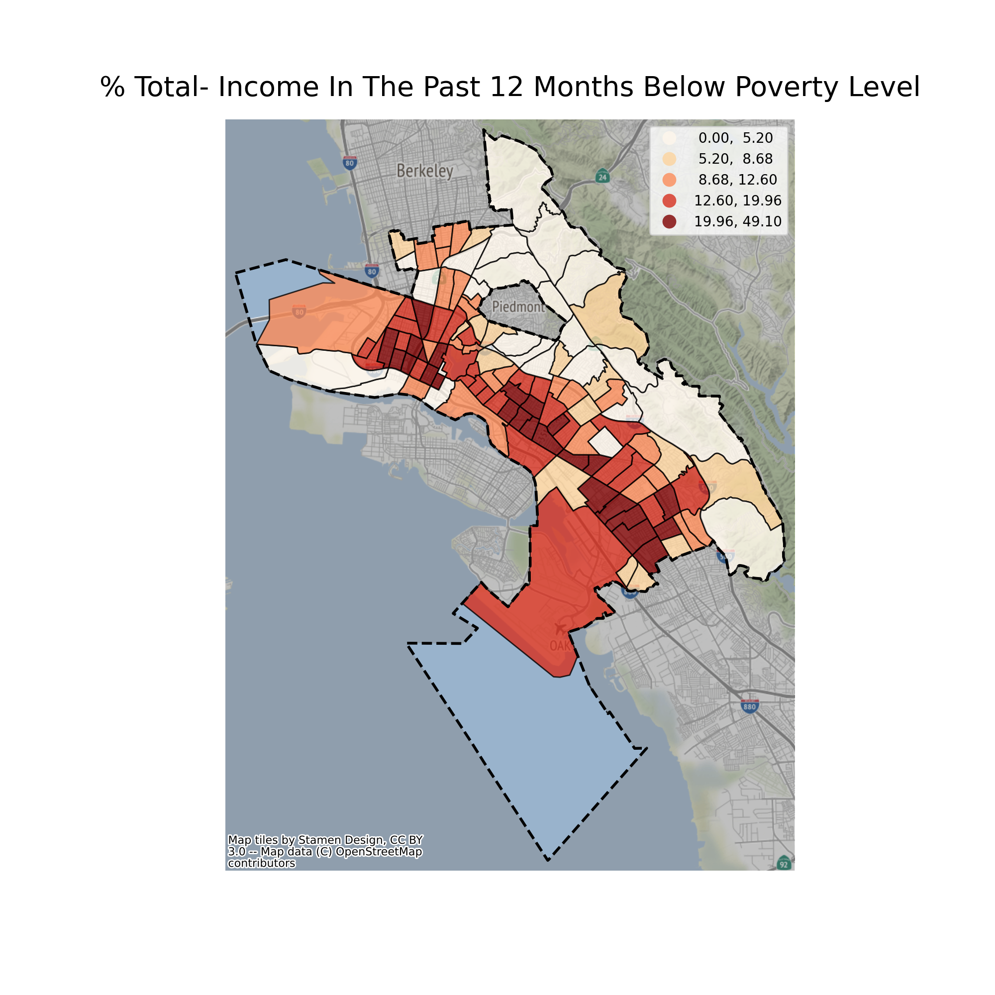
.png) It is also evident in the below map to see that the percentage of people living in poverty is reversely correlated with the property values.
It is also evident in the below map to see that the percentage of people living in poverty is reversely correlated with the property values.
How do people ger around?
The City encompasses various ways of mobility options, from driving on the City’s highways and roads, taking public transportation, and biking or walking.
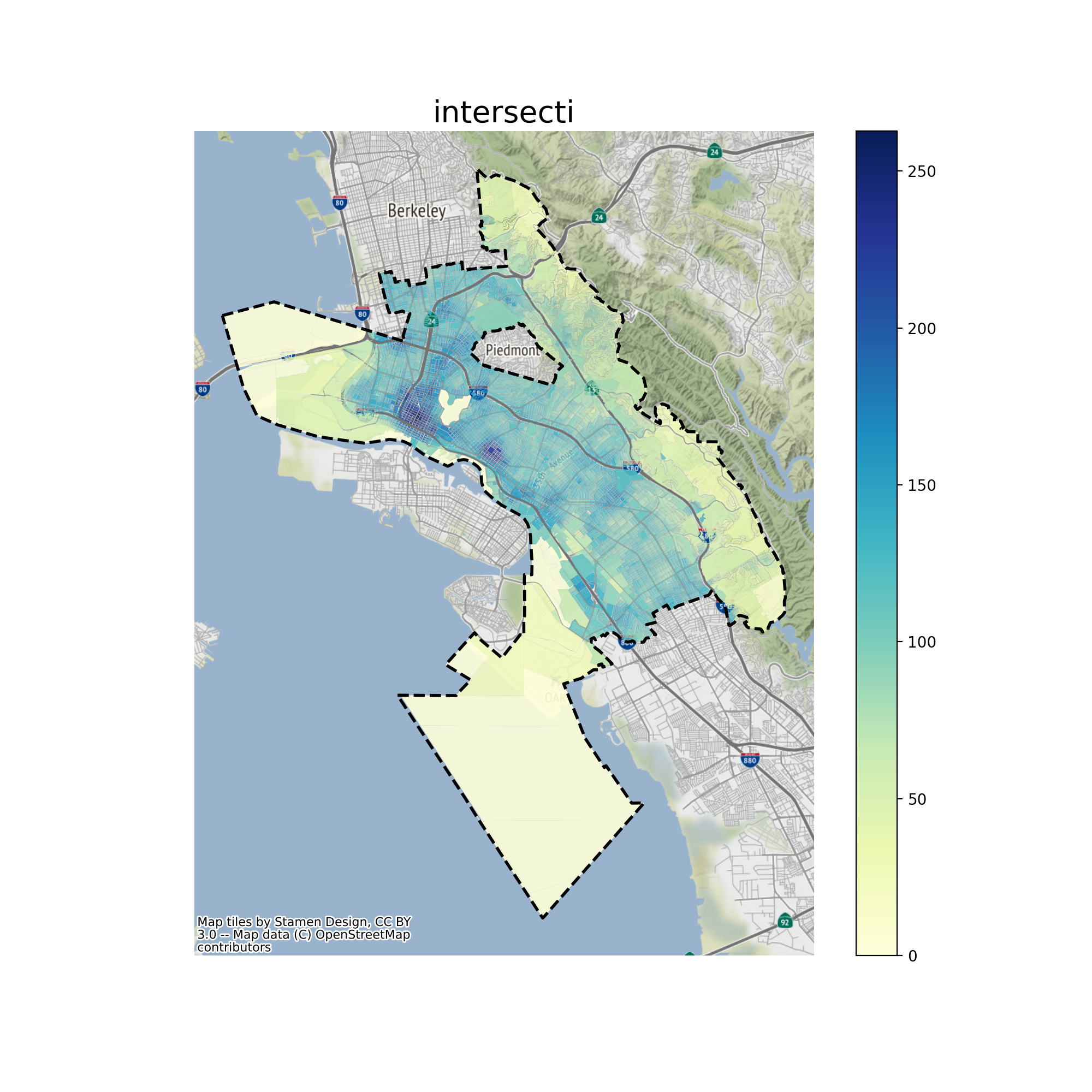
Measuring Walkability
Intersection density has been used as a proxy metric to measure the walkability of a place. Below is a map visualizing this in space:
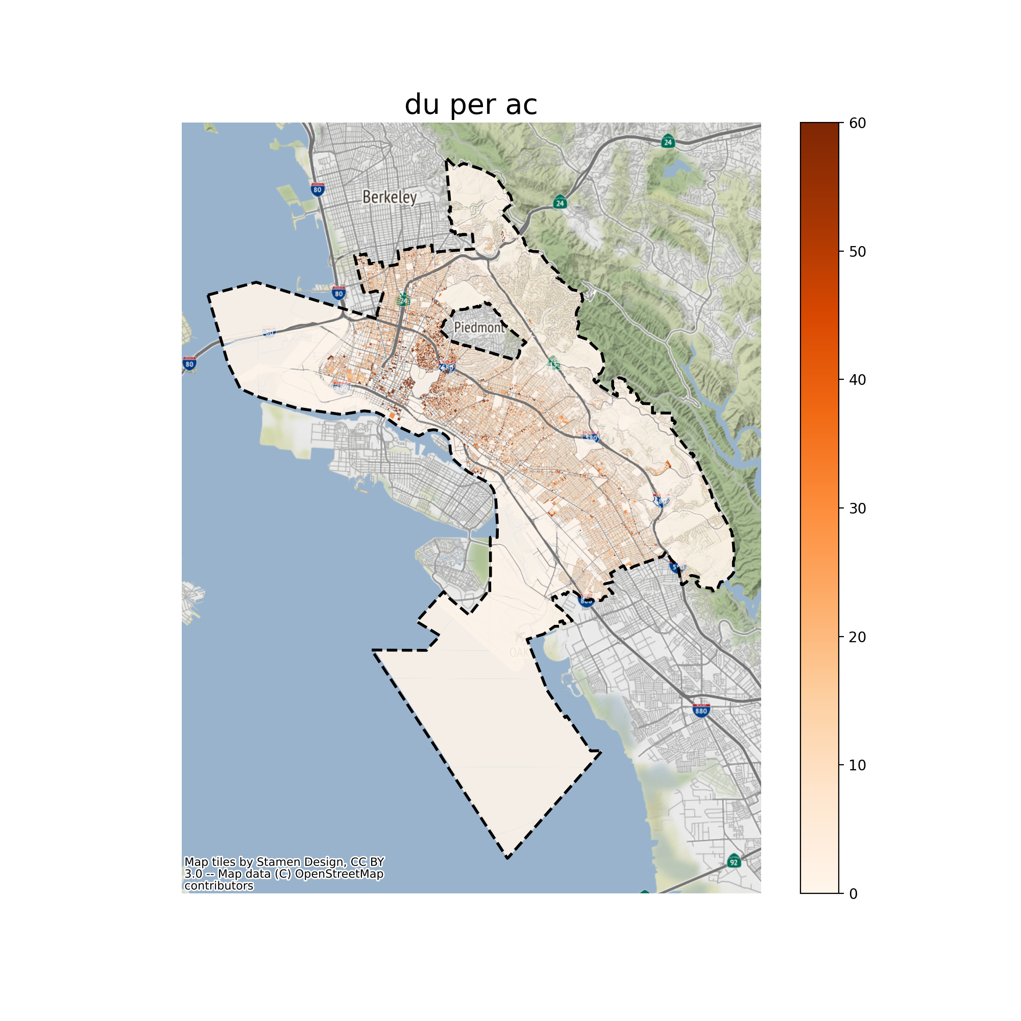
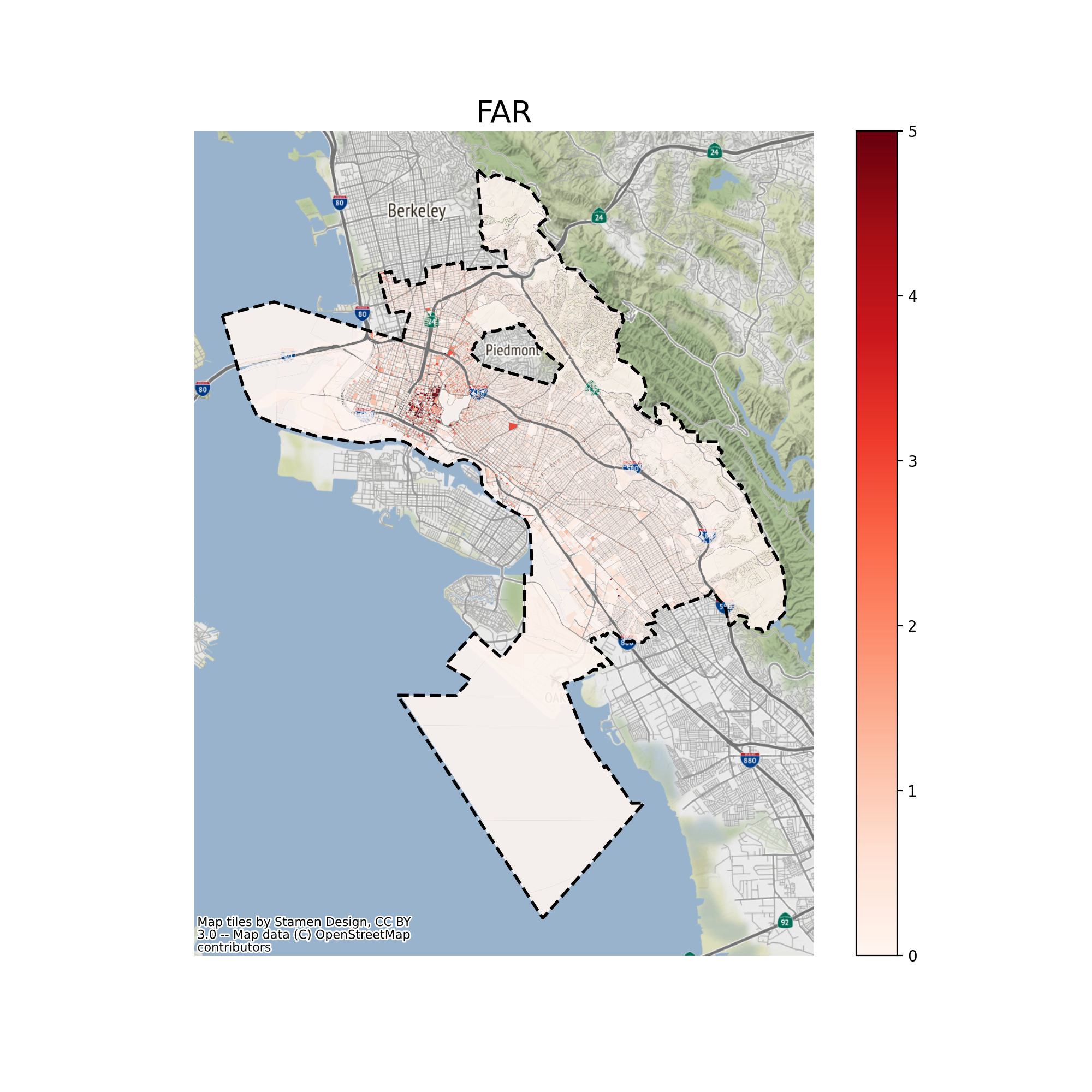
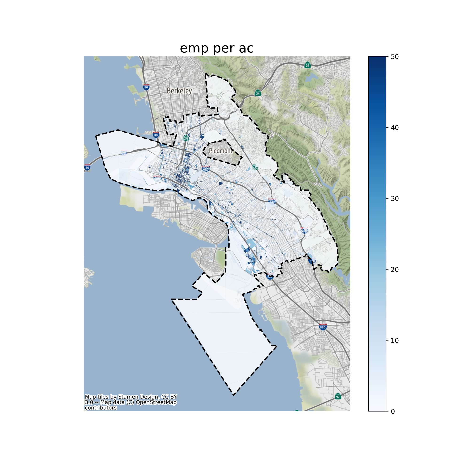
Other Existing Condition Maps
The Python Script
Following are some code snippets that correspond to each major steps in this automated data pipeline script.
Data Fetching via APIs
def print_message(message):
  print(message)

print_message("Request data via APIs")
Charting via Dash and Plotly
def print_message(message):
  print(message)

print_message("Making interactive charts")
Geospatial Mapping via GeoPandas
def print_message(message):
  print(message)

print_message("Making maps")